
Welcome to Gulf & Fraser!
For over 80 years, Gulf & Fraser has been dedicated to serving its members. Following recent mergers and substantial growth, the credit union embarked on a rebranding journey to attract a younger members. Utilizing the logo, colors, and brand guidelines provided by the design agency, I developed and maintained the refreshed Gulf & Fraser identity, visually communicating the vision and values to gain public recognition.


Using characters to enrich the brand.
To convey a welcoming, positive, and empowering vibe, we incorporated approachable characters from blush.design. By customizing these characters with Gulf & Fraser’s colors, they became central to the brand, helping to build communities and make the brand more interactive in the digital space.
Different touchpoints for the rebrand

Members card – The very first physical touchpoint
The member card is one of the initial touch-points for members, made memorable by the signature Gulf & Fraser symbol.

Internal-use wallpaper
In addition to showcasing the Gulf & Fraser brand to the public, it’s important to create items for internal use that staff can take pride in.
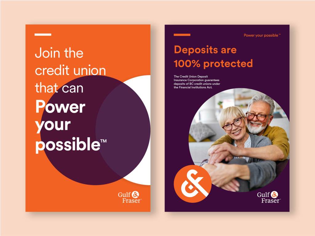
In branch posters
Branches are where members can experience the rebrand firsthand. The posters at branches embody the brand colors and message, intertwined with a confident tone of voice that reassures members about banking with Gulf & Fraser.
Showcasing Gulf & Fraser in public
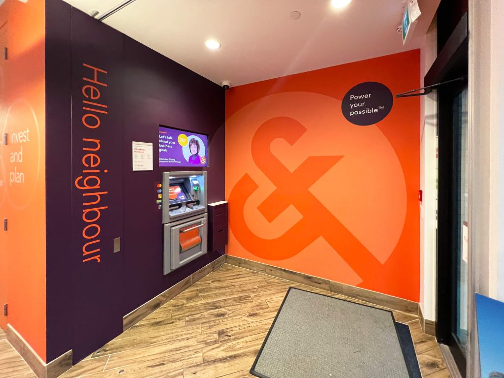
Branches
With over 26 branches across the Lower Mainland and Fraser Valley, we partnered with a local sign company to create custom vinyl displays, showcasing the refreshed look to our members.
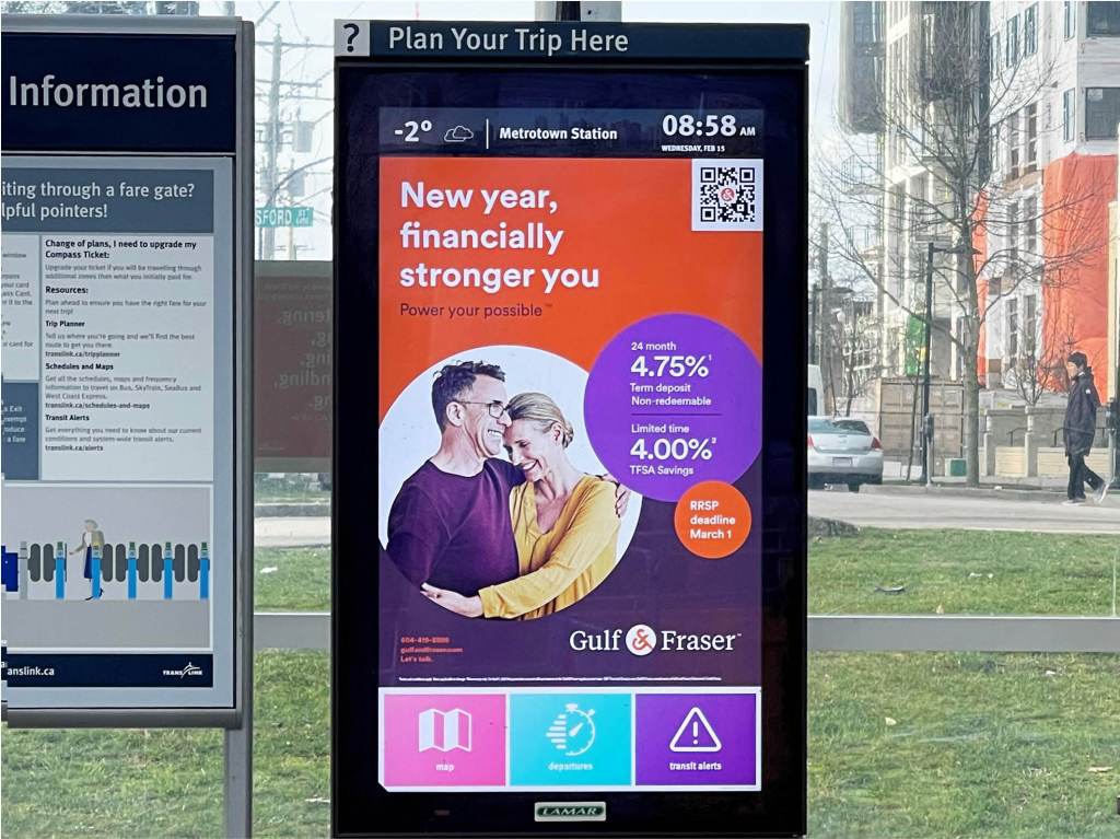
Digital display in transit stations
Gulf & Fraser new brand can also be easily spotted at different transit station.
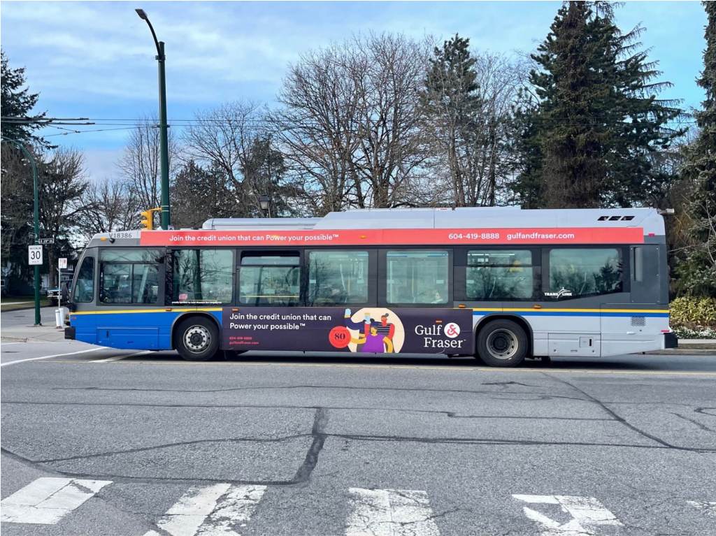
Translink buses
We want everyone to see the new brand and introduce it to the public. To maximize awareness, we are promoting it with buses driving around the Vancouver area!
